
Simon Says Stamp Monday Challenge
Sparkle and Shine

Good day, fellow crafters. Today I present to you a creation for the Simon Says Stamp Monday Challenge that I just completed. This week's theme revolves around Sparkle and Shine, and I had the perfect thing for this project, metallic watercolors! These magical pigments contain shimmering particles that catch the light and bring a captivating glimmer to your artwork. I hope you enjoy my submission.
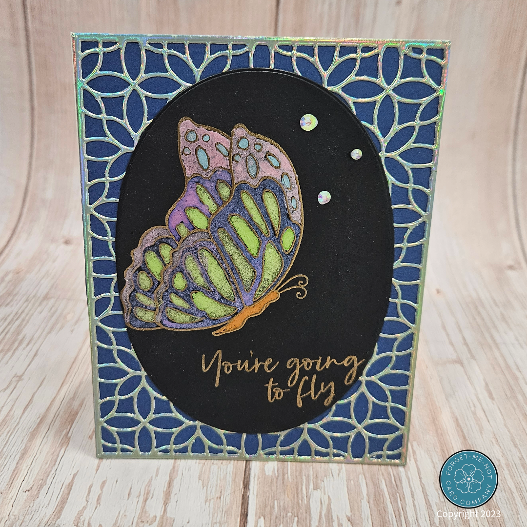

For this card's foreground element, I began with some black cold-press watercolor paper that I picked up from Michaels and the Simons Says Stamp Butterfly Dreams stamp set. To get my image ready for the magic touch of the metallic pigments I first aligned the stamp I wanted to use and the sentiment in my Misti stamping tool. Once I had the placement I wanted I coated the stamps with some clear embossing ink and then with even pressure applied, stamped the image onto the paper. I next covered the image with a extra fine gold embossing powder and heat set the powder.

After the heat embossing had cooled I used my Arteza Metallic watercolor paints to color in the image of the butterfly. This turned out absolutely AMAZING in person, the shine and sparkle that the metallic pigments provide when used are totally worth the cost of this more expensive brand of watercolor pigment. But here's the heartache: a photograph struggles to tell the story. The camera lens fails to capture the interplay of light and shadow, the way the metallic pigments dance and shimmer with every tilt of the card really needs to be experienced in person. Once the watercolor had dried I utilized one of the nested ovals from my set from Waffle Flower to cut it to shape.
To create the midground for my card I decided to add even more sparkle, because you can never have too much right? So I broke out my metallic mirror cardstock from Tonic Studio and ran it through my die-cut machine using the Floral Geo Cover Plate from Sugar Pea Design, featured right. The sparkle on this was again, AMAZING in person, and when combined with the butterfly it really stood out.
The next step was to assemble the card. In order to give the mirror paper even more appeal I added a dark blue almost purple cardstock behind it. Once those were adhered together I used some double-sided tape to adhere the butterfly foreground to the mirror paper. Lastly, I adhered the composite background panel to a cream-colored A2 card base and then added some Kat Scrapiness Crystal Rhinestones for visual appeal to finish.
