Rediscover your Supplies Challenge - June 2023
Rainbows
Good day, fellow crafters. Welcome to a world of handmade greeting cards bursting with vibrant rainbows! In this post, I invite you to join me on a creative adventure where we'll explore the wonders of crafting a stunning card using only the supplies found in my very own stash. Unleashing my imagination and embracing the kaleidoscope of colors at my fingertips, I'll show you how to transform ordinary materials into extraordinary works of art. I hope with this card I will inspire you to create heartfelt and personalized works of your own that bring joy and warmth to the lucky recipients. So, grab your scissors, glue, and a sprinkle of creativity, as we embark on a delightful journey of handmade cards adorned with the magic of rainbows! I hope you enjoy it.

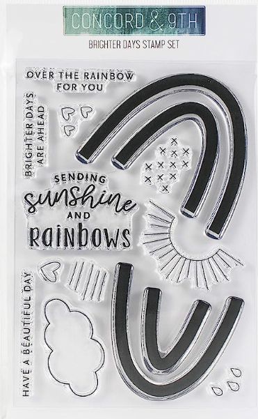
Brighter Days Stamp Set 10790
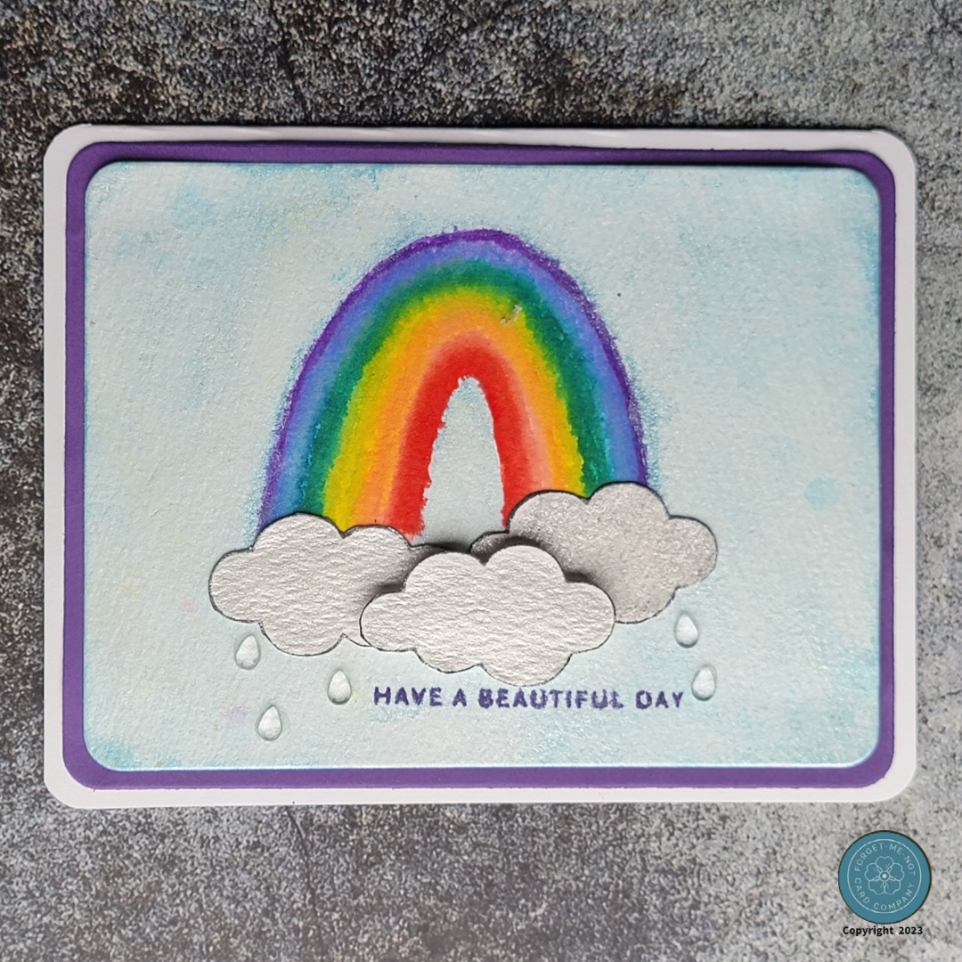
To create the background for these cards, I carefully gathered my supplies and set them in order. My chosen materials included premium white watercolor paper, Staedtler watercolor markers, Concord & 9th's Brighter Days Stamp set, Altenew Crisp Ink in the color of Ultraviolet, metallic watercolor pigments, and purple cardstock for the mat. Once everything was ready, I began the creative process.
Initially, I attempted to stamp the rainbow using pigment inks after aligning the pieces on my Misti stamping tool. However, I wasn't satisfied with the result as the design of the stamp set left a gap between the colors. This setback encouraged me to come up with an alternative solution, which actually turned out to be even better. Enter watercolors, my trusty go-to medium! Using the same setup as before, I aligned all the pieces in my Misti tool and used the Staedtler watercolor markers to "ink" the stamp. After dampening the stamp, I carefully stamped the image onto the watercolor paper. Though the gap still persisted, I found that by adding a little more water with my watercolor brush, I was able to blend the colors together, resulting in a more authentic-looking rainbow. Once I was satisfied, I allowed the colors to dry before proceeding to the next step.
To complete the background, I wanted to convey the illusion of the rainbow being in the sky. To achieve this, I utilized metallic blue watercolor pigments and a touch of water to create a light blue wash, which I carefully painted all around the rainbow. This technique worked wonderfully, providing a subtle glimpse of the blue sky peeking through the white clouds.
For the foreground, I decided to incorporate the clouds from the same stamp set. Using black ink, I stamped the clouds and then adjusted their appearance to look more like storm clouds by applying silver metallic watercolor pigment. After allowing them to dry, I fussy cut around the cloud shapes and mounted them onto the background. To add depth and visual interest, I opted to raise one of the clouds using pop dots. This simple technique made the card pop, but it still felt like it was missing something. Suddenly, inspiration struck—I realized it needed rain! To achieve this effect, I incorporated clear, flat-backed water droplets from Kat Scrappiness, completing the visual narrative of the card.
The next step was to trim the background and mat to their final dimension, round the corners to match my pre-cut A2 white card base and assemble them together. Lastly I chose my sentiment, again from the same stamp set, and using the Altenew Crisp Ink in Ultraviolet stamped it onto the card.