
A Thinking of You Card inspired by Altenew
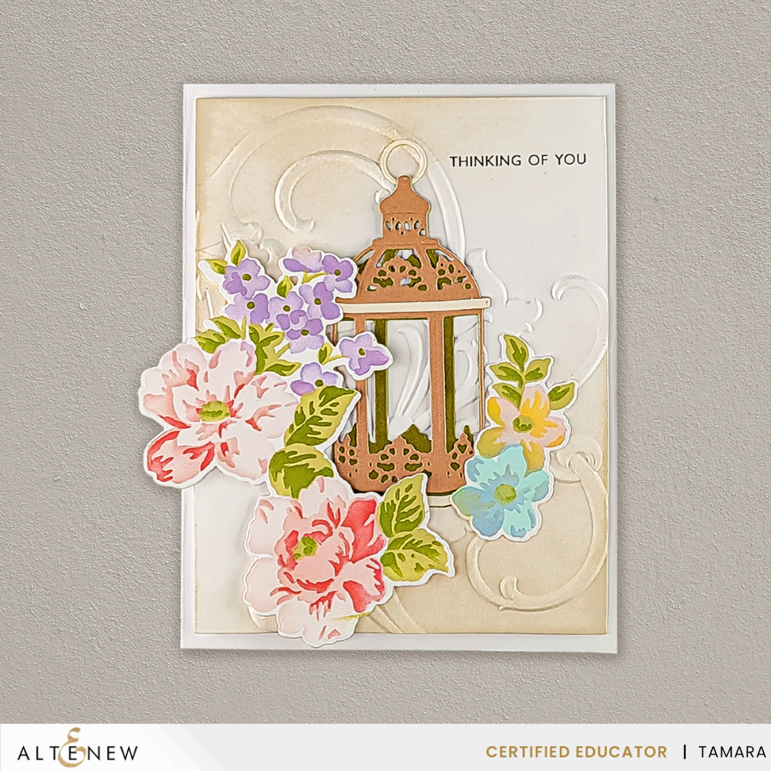
Some cards say a lot. This one says one thing: I'm thinking of you. I kept the message small and let the flowers do the talking. Pink peonies, soft lavender blooms, and a copper lantern sit on a cream panel with embossed swirls, and the whole card is built to feel warm without feeling busy.
This is a card to send any time someone is on your mind, no occasion needed. First I'll show how it's made. Then I'll explain why it works, and I'll finish with one idea you can try on your own cards.
Design Details
The background. The cream panel has soft embossed swirls and warm, soft edges. Embossing adds texture without adding color, so the flowers stay the star. A quiet, textured background like this is a good choice any time your focal point is busy.
The flowers. Two large peonies, a lavender cluster, and a few small aqua and yellow blooms give the card three sizes of flower. Mixing sizes adds rhythm, and the small blooms keep the eye moving toward the lantern.
The lantern. The copper lantern sits behind the flowers, so the blooms look like they're spilling out of it. Tucking one element behind another adds depth, and it makes the pieces feel like one scene instead of separate stickers.
The sentiment. "Thinking of you" is small, black, and set in capital letters in the open space at the right. Leaving room around a short sentiment lets it read clearly without competing with the flowers.
Why This Card Works
The big flowers hang past the left edge of the cream panel. When a focal point crosses the edge of its frame, the card feels bigger and more relaxed, because the eye isn't stopped by a border. That's a simple way to make a small card feel generous.
Your eye also has an easy path to follow. It starts at the large peonies, moves up through the lavender blooms to the copper lantern, and finishes on the small black sentiment at the right. Big, then medium, then small is a path anyone can follow, and it's one you can plan on any card.
The colors help too. Pink and copper are warm, while lavender and aqua are cool. A little cool color keeps a warm card from feeling heavy, and it's an easy balance to try with the inks and papers you already own.
Creative Takeaway
Pick one focal point and let it cross the edge of your panel. Then keep the background quiet, with one neutral color and a little texture. Try it with any flower cluster and any embossing folder you own. It's a quick way to make a simple card look planned, and it works for any occasion, not just thinking-of-you cards.
To sum it up, this card has a quiet embossed panel, flowers that spill past the edge, and a short sentiment. That mix is how it's made, and it's why the card feels bigger and warmer than one that stays inside the lines. Now think of someone, and send them a card this week.
Visit My Affiliate Resources Page
Remember, Crafting is Happiness
Tamara
Forget-Me-Not Card Company · We Craft Happiness Here
This post contains affiliate links. If you shop through them, I may earn a small commission at no extra cost to you.